Epic Games –
Epic Rewards
Extending audience reach and brand engagement
2022 | Instrument
Team makeup: Visual Designers, Producers
+ Myself, as a UX Strategist
This project involved: UX Strategy, IA, Writing
My Contribution: I was brought onto the project at the tail-end to cover testing refinements, edge cases and page states. I focused on microcopy improvements, account management navigation, and a communications strategy for the rewards program launch.
Project Background
Who, What, and Why?
Epic Games is a leading interactive entertainment company, well known for its 3D technology Unreal Engine and Fortnite, one of the world’s largest games with over 350 million accounts and freely made available from the Epic Game Store (EGS). EGS is a key Epic marketplace with a far global consumer reach.
As a result of other large publishers in gaming prioritizing cross-platform releases and direct availability through their own storefronts, marketplace loyalty has become a constant battle of choosing between title and platform-specific incentives.

The Opportunity
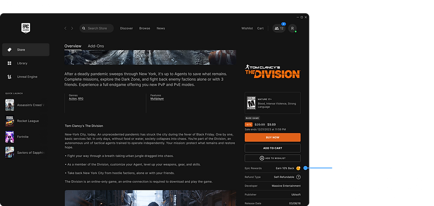
Once again we partnered with Epic and fleshed out the end-to-end Epic Rewards experience in order to build customer loyalty and increase customer acquisition. The program meaningfully rewards purchase activity with additional store spending power, positioning EGS as a player’s first-choice for buying PC games.
User Research
What we tested
Prior to my project roll-on, the team defined and designed the end-to-end experience. They conducted usability testing where participants completed discovery and comprehension focused tasks, and provided UI feedback.

Earning A Rewards Balance
Could participants understand the mechanics of the rewards program with the help of well-placed copy?

Redeeming Rewards
Could participants understand how to apply rewards to purchases? How much help copy would they need?

Finding Rewards History
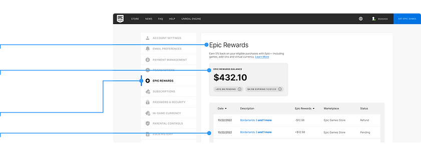
Could participants find past purchases and decipher the transaction details? Were the details provided in a easy to digest format?

Overview Page in EGS vs. Account Management (A/B testing)
Participants compared a vision state overview page against an enhanced current account management so that we could determine desirability and comprehension.
Overall participants found the experience to be intuitive and thoughtful which highlighted the need for a simplification in our approach to how and when program messaging appeared to remove information overwhelm.
Resulting Testing Refinements
Rewards program messaging
-
Intentional use of rewards specific design elements
-
Contextual and highly visible messaging of program restrictions
Audience communications
-
Use of email notifications for key touchpoints & messaging
Account management
-
Simplified transactions history and details for Epic Rewards
I was brought onto the project at the tail-end to cover testing refinements, edge cases and page states. I focused on improving rewards specific microcopy and account management navigation, and additionally crafted a communications strategy for the rewards program launch.
UX Strategy
Rewards program messaging
Testing revealed that half of the participants missed rewards specific copy until they were late into the game purchasing journey, on the order confirmation page.
Testing also showed participants struggled to quickly understand program restrictions. Copy and messaging needed to clarify the following:
-
Rewards expire
-
Rewards can be earned and redeemed on most purchases
-
Rewards are pending before they are available


Once players reached the Checkout page, they would have visibility and access to program restrictions and expiry information.


UX Strategy
Rewards program messaging
Testing revealed there was insufficient information in the transaction details, although it did not prevent them from understanding the transactions. Purchase history needed to include:
-
Item descriptions rather than only an order number
-
The Epic Rewards redeemed on the purchase or indicate the use of coupons


UX Strategy
Communications Strategy
Although the UX had been figured out for the program as a whole, there were inconsistencies in the way we were approaching the language of Epic Rewards.
I created a set of strategic communication plans to identify where, when, and how Epic might engage with its audience in the primary channels, email and in the EGS launcher (native desktop app).


The main stakeholder was able to use these artifacts internally and make informed decisions about their marketing approach and future capabilities they would need to bring some of these recommendations to life and improve their methods of audience engagement.


As part of the strategic communication plans, I created a lo-fi wireframe imagining the marketing page that would announce the Epic Rewards program. The goal of this page was to provide a persistent destination to drive people to in order to learn about the rewards program.
The recommendation served as a framework for the kinds of information that should exist on the page, the order of that information, and possible CTAs to drive towards. This page would house program FAQs, content we knew needed to be easily accessible. The page also needed to exemplify the simplicity of the rewards program, in content and layout.
A quick benchmark of other reward program landing pages resulted in this recommendation. The client was able to take this back to his internal Marketing team and inform decisions a low-lift implementation.
Outcomes
A Successful Program Launch
The designs implemented and handed-off by our team are in full effect today. The Epic Rewards program is available to millions of players able to freely take part in earning rewards!
Download the EGS launcher and you too can earn rewards with any of your favorite game purchases!

Checkout the announcement pages informed by my communications strategy work